Topics
Choose a topic to explore with interactive maps and charts
- Medicare Reimbursements
- End of Life Care
- End of Life Cancer Care
- Mapping COVID-19
- Primary Care Access and Quality Measures
- Post-Discharge Events
- Medical Discharges
- Surgical Discharges
- Data By Hospital
How to use Interactive Apps
Tips for using our Interactive maps and graphs
How to:
There are a number of ways of interacting with the maps and various charts, including viewing full-screen, downloading a graphic version, and filtering data to discover insights. Read more below or view the following short video tour:
View by Map, Bar, or Distribution
You can currently view data in three ways.
Map – move the mouse over a part of the map for more detailed information. Use the data filters to adjust the measure viewed and other parameters.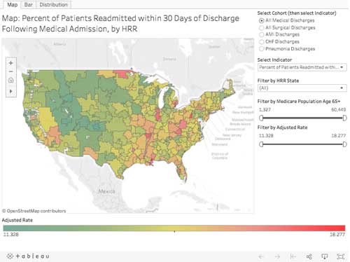
Bar chart – adjust the data filters to change the measure viewed.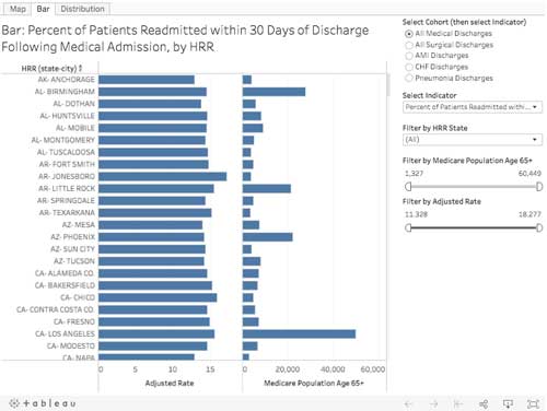
Distribution Chart – adjust the data filters to change the measure viewed.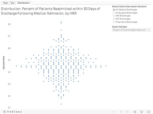
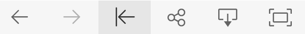
View Full-Screen
To view a chart in full-screen, select the “Full Screen” button in the lower-right. Hit Escape key to get out of Full-Screen mode.
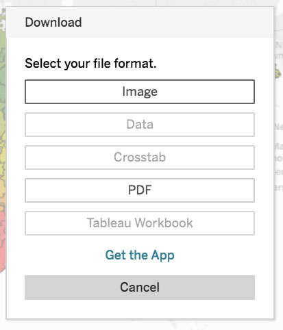
Download Chart
You can download a chart in .png or .pdf format using the Tableau “Download” button.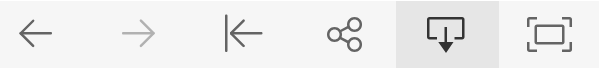
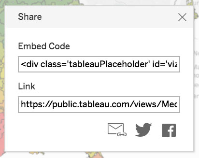
Share Chart
You can share our chart using the Tableau “Share” button. This includes emailing link, twitter, facebook post, and code for embedding our chart into your website (please link back to https://www.dartmouthatlas.org and give attribution to “Dartmouth Atlas of Health Care”).
Reset View
After adjusting the data filter settings, etc., and you want to reset the view to the initial default state, use the Tableau “Reset” button.